Murphy
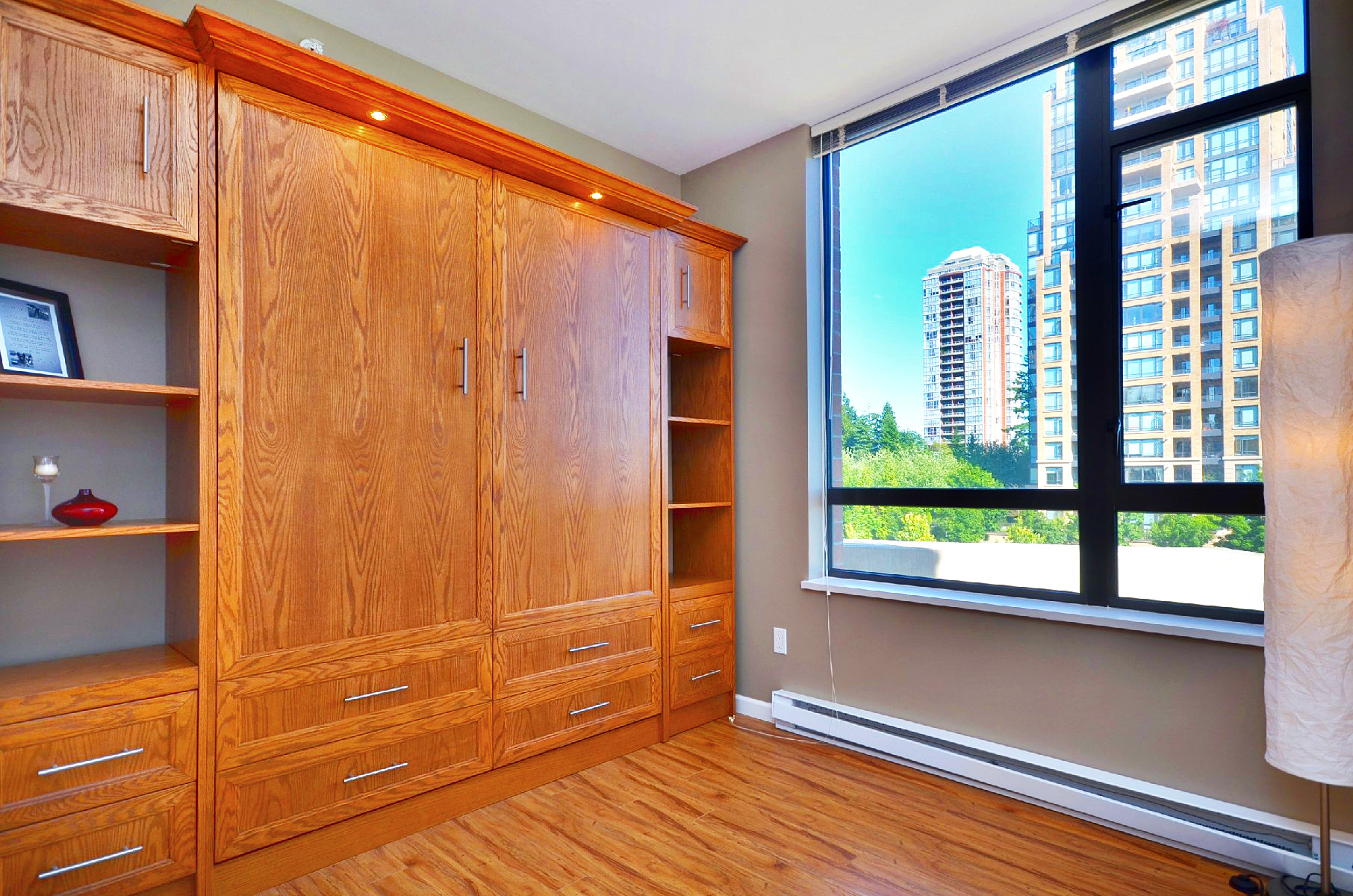
Murphy beds always seemed a bit excessive to me; just too permanent and too large. But since seeing one at one of my recent sold properties, I’ve had a change of mind. It worked perfectly for this 850 square feet, 2 bedroom condo, by providing a queen size bed and generous wall to wall storage around it. With the bed being so easily stored when not in use, it kept the guest room looking tidy and free for other uses. More so, it was a great selling feature that helped distinguish the condo from other competitors around the area. While initial costs for a Murphy bed may seem daunting compared to that of a sofa bed, it’s worth the investment for living a clutter-free condo lifestyle. And when it’s time to list and sell the place, it just may be one of the features that help you catch that buyer with the right price and minimal time on the market (This condo was sold in 19 days)!
Small Space Big Living
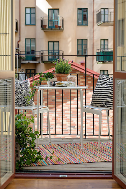
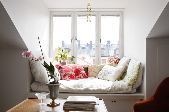
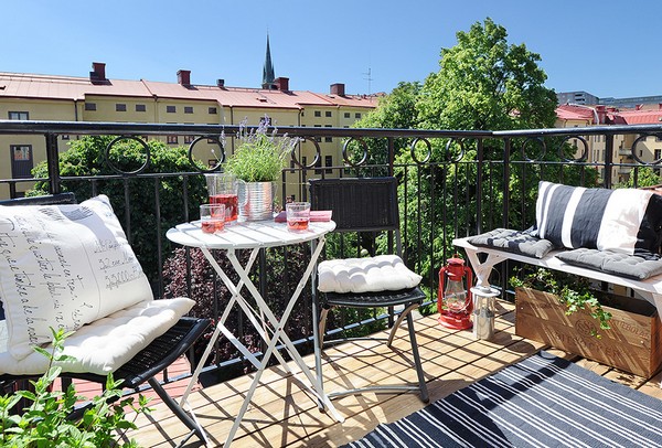
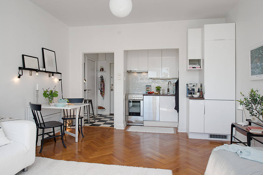
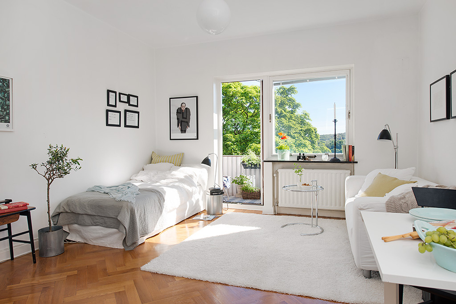
Sprawling living rooms and grand kitchens used to catch my eye in lifestyle magazines and real estate listings, but since the last blog post, small spaces have been on my mind. No one does thoughtful small spaces and places like the Scandinavians do. They are able to effectively combine form and function, and fuse simplicity and character using very limited square footage. It’s a lesson on city living without ever compromising comfort and style. Here are some inspirations that we have been admiring here at Can Sell My Home for this week. We love the theme of keeping walls white in order to maximize light, while using unique accessories to add contrast and personality.
(Image 1)
Nook (Image 2)
The right furnishings make even a tiny balcony a retreat (Image Credit 3)
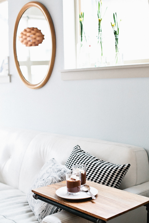
All the essentials in a single, bright and functional room. (Image Credit 4 & 5)
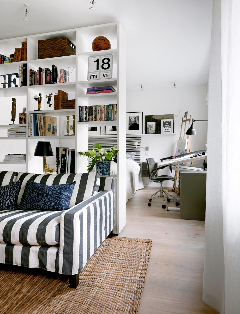
Great room divider doubling as a shelf in a studio apartment (Image Credit 6)
Good Living in the Urban Jungle
With the Greater Vancouver real estate market being what it is, many families, my own included, has had to make the tough choice between urban living in smaller quarters, versus moving further out to get a better bang for the buck. While my wife grew up in a house and with where we currently live, often bemoans the loss of that lifestyle (Gone are long driveways for easy parking, plenty of storage space and stretches of lawn), we have found that having a family in tighter quarters can still be both functional and beautiful by following a few simple guidelines:
1) Keep only what you use: With less space to stash things, a small place will keep you honest about what you need and what you don’t. If you haven’t used an item in the past year (all four seasons) and it isn’t some irreplaceable, highly valued piece or family heirloom, then you probably do not need it. Do yourself and someone else a favour by passing the item(s) on. You really do not need to continue saving all those books that you will never re-read or clothes that no longer fit “just in case”.
Not convinced that you can let that collection of shopping bags or the college textbooks go? Take a look at what the Queen of Home Organization, Martha Stewart, has to say about this here.
2) Purchase only what is beautiful: If the item is on sale but you wouldn’t consider it otherwise, walk away. Your life shouldn’t be cluttered with things that don’t make you actually want to have or need to use it. Period.
We recently came across a great example on Design Sponge of a family of four effectively making use of their small place in Seattle here.
3) Get organized: This is probably the hardest one to follow for all of us out there who juggle the chaos of a busy life, but with a few good organizers and investing in effective storage space, you would be surprised at how much you can actually hide away in a small space. More importantly, you will be able to easily find items again.
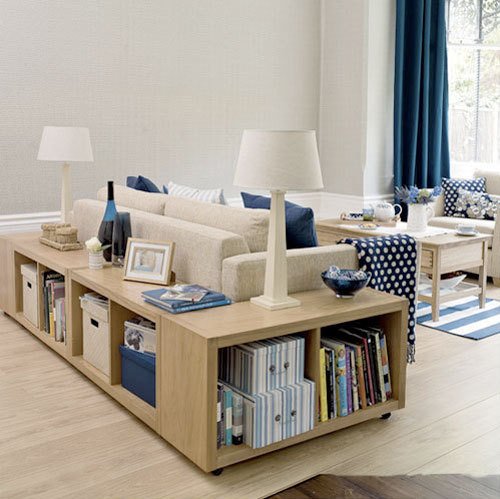
Great DIY for making use of that space around a couch (Image Credit 2)
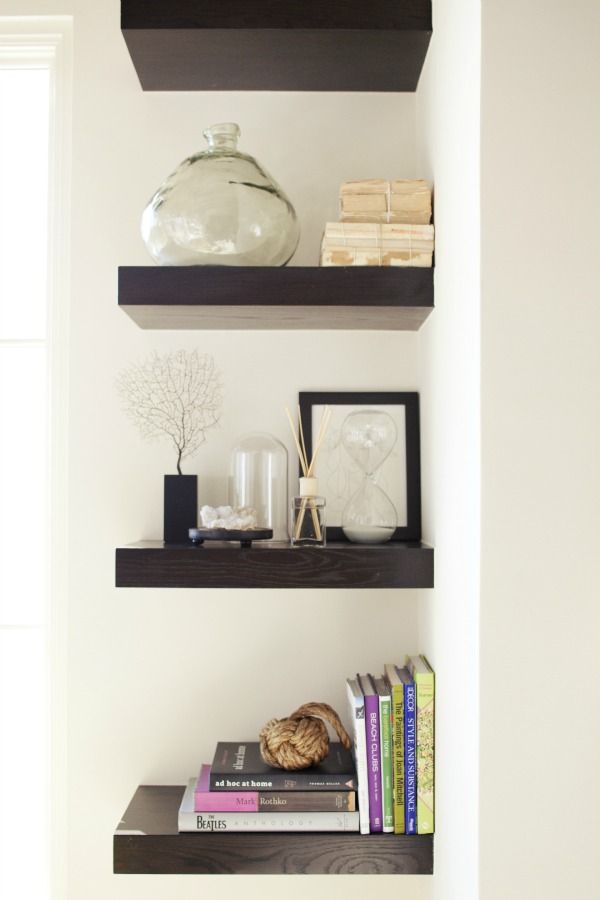
Using corners wisely (Image Credit 3)
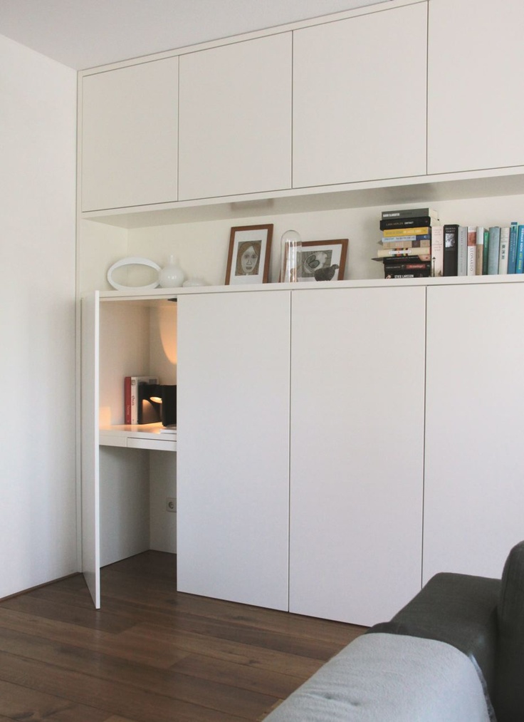
Custom wall to wall, floor to ceiling shelving- and even hidden desk- for maximum storage (Image Credit 4)
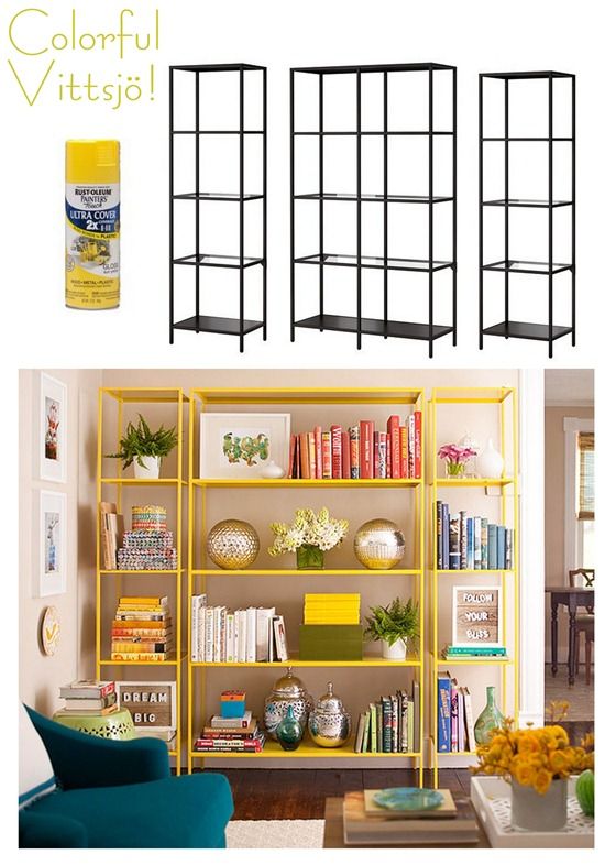
On a budget? Above is a great Ikea hack for cost effective shelving (Image Credit 5)
And above all else, just get over the idea that bigger is better. Yup, just throw the idea out. You do not need a “McMansion” to be happy. Sure, wouldn’t we all love a sprawling property that rivals something out of MTV cribs and still has “location, location, location”, but comfortable and good living in the urban jungle can be achieved with simple but fulfilling and functional living.
Faux Bois
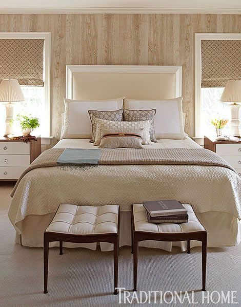
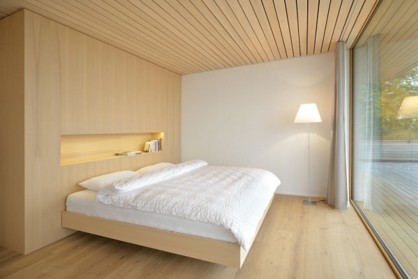
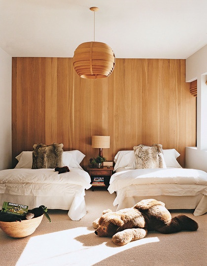
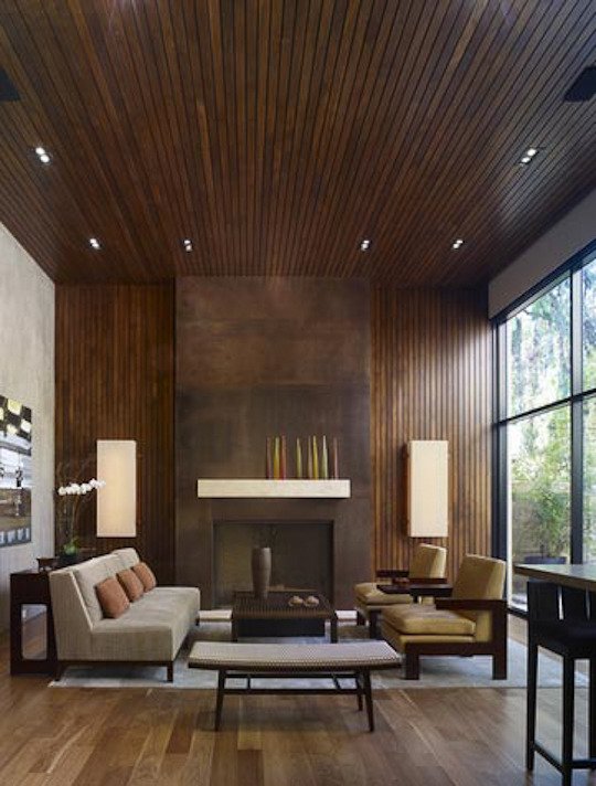
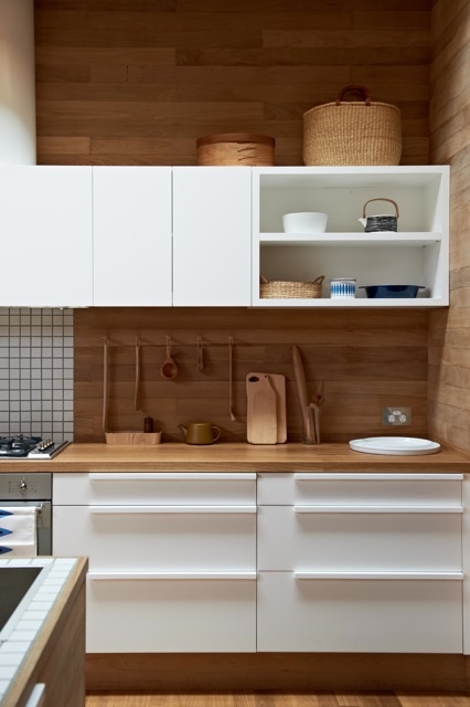
The 70’s have long passed but wood paneling is still alive and thriving. Don’t be mistaken though. These modern day interpretations are not those dark, dingy veneer strips that haunted family rooms and basements of yesteryear. These are fresh takes that bring in warmth and texture without hindering natural light. Below are some great inspirational images of rooms with wood paneling done right. I have yet to have any clients specifically request wood paneling when hunting for a place, but I’m sure they wouldn’t mind any of the spaces shown below in their own homes.
Scenic Sundays

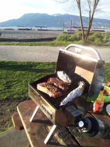
There’s not many things better than a spur of the moment BBQ at the beach on a sunny Sunday evening. Jericho beach was the perfect setting for some good food, conversation, and amazing view of Vancouver downtown and the North Shore.
Visual Marketing in Selling Your Home
In a buyer’s market that is growing increasingly more competitive, standing out in a sea of properties that are also for sale and being able to market your home or property properly on the MLS is vital. A few years ago when it was a seller’s market, calls and offers would be rushing in not long after the For Sale sign had been put up; the news and real estate forums were flowing with updates on “overseas buyers” who didn’t need to view properties or images to place impressive offers. But with today’s shift to a strong buyer’s market, acquiring quality images of the property can be the difference between a listing that quickly receives activity, versus one that languishes longer than it needs to on the marketplace.
As part of my 10 step marketing plan that is custom tailored to each property that I list, one of these steps is using a professional photographer for good images and a 360 degree tour of the space or home. While it may seem easier and cheaper to simply snap a few images with the handy phone- which is a common practice in the world of real estate- I employ the right people and equipment (such as wide angle lenses and professional lighting) to produce quality images that capture the best features of a property and draw the discerning buyer in. On top of hiring a professional photographer and not using a pocket digital camera or cell phone camera, I add the extra touch by applying filters to make the pictures stand out.
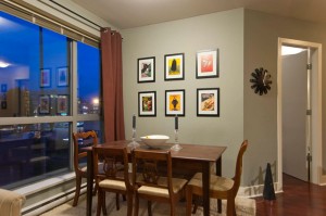
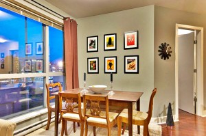
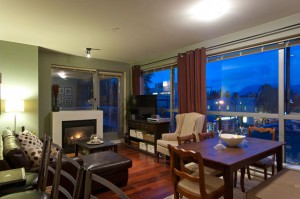
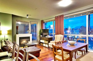
An example of a standard shot, versus an image that brings out the best in a property can be seen in the images of the dining area above. While the picture on the left is the standard shot that is provided by the photographer, the one on the right is one that I finished using software to reflect the warmth and size of the space. It highlights the extra details such as the expansive windows, clean moldings and rich hardwood. More importantly, it clearly stands out in comparison with other listings that this property is competing with.
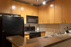
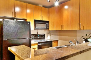
Below are other comparisons of a simple snap shot (to the left), versus the images on the right that show the same space, but with the depth and warmth that this home has to offer.
I have had people come in to the open house and give their positive feedback in regards to the visual presentation of the listing.
These pictures are advertised on the MLS, our own website, Craigslist, Youtube and Facebook.
In addition, these images also go into a two page, eye catching full-colour brochure.
The ultimate goal with any properties that I list is to get the maximum dollar for my client. My collaboration with a professional photographer and photo touch-up system is another tool in my marketing arsenal that allows me to accomplish that.
When it comes to using the right marketing in selling your home, whether it is doing a photoshoot, 360 tour, brochures, direct mail or internet marketing, shortcuts are not an option.
* This particular condo as shown in the above images is located in Kitsilano, Vancouver and sold for asking price.
If you have any questions about marketing and selling your property feel free to give me a call @ 778-371-1534

